Blog
The Art of Pencil Crayon Painting 7
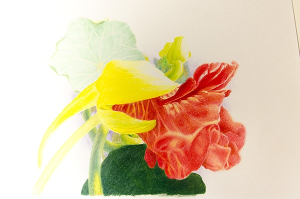
I decided to experiment with using only Irojiten pencil crayons as I said in my last blog. I was, at the same time, experimenting with some other papers and chose the Canson white 123 lb. acid-free paper. The paper is a bit of a blue-white and has little tooth. In the end, I don’t think I will use this paper again and it may have affected the results to some degree. The picture I worked on is approximately 14 X 11.
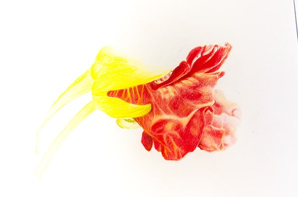
The most striking result for me was the degree of transparency of the pigments. It is like colouring with gemstones. This has both advantages and disadvantages. In the first photo of the work below it is hard to see but I did use some light green underpainting with the red of the petals. This worked very well as the colours blended well and the underpainting provided a true feeling shadow. (please note that the photographs here are not high quality as I did not wish to fuss too much over the photography). The reds and greens in the yellow of the bud were beautifully rendered as the yellow was both transparent and enhancing of the underlying colour. (Sorry the photo does not do justice).
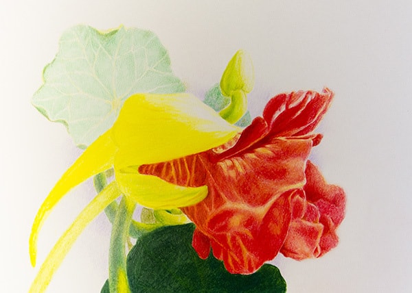
Another thing that I noted was when I did lay in a lighter colour fairly solidly, when I brought in a darker colour (green or red) the undercolours seemed to repel further layers. This gave good effects but was a barrier to deepening colours in areas that needed it. In fact, the transparency of the pencil crayons made it difficult to darken the reds in the petals as much as I would have liked. It was hard to not break down and grab another pencil crayon brand. I had expected greater ability of overlay colours but this may be a factor of using different brands than a specific brand issue. (~note to self, when really bored one day, check this out.)
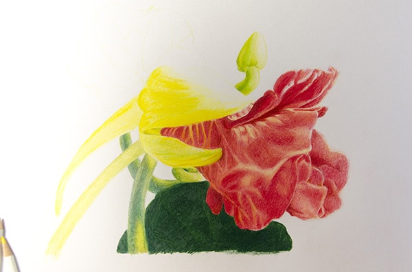
I think that the smooth paper may have had an impact as well as in this photo, you can see that the dark green section is nice and smooth, but not very interesting and did not take on other layers of colour well.
I tried using one addition of a workable fixative to see if the red petals could be worked more and it did help a bit. Again, the paper may have been part of the problem. In the end, I really like many of the qualities of these pencil crayons and as I said before, there are real advantages of having many different types of crayons that perform differently. One last thing, the colour range is a bit weak. The range of reds is very small. Basically a brownish crimson and a cherry red. The other red range colours like maroon and so on are quite brown. Lots of pinks however. In my next blog, I will be looking at some of the transparency and coverage issues with Irojiten.